VIX, Stocks, China and More
Nasdaq 100, Dow, VIX, Dollar, USDCNH, Inflation and Recession Talking Points: The Market Perspective: Bearish Risk Trends; Bearish Dollar; Recession Proofing With December and 2022 coming to a close, it is a good time to review very high time frame charts (monthlies) which can give scope to macro themes This article reviews the Nasdaq–Dow ratio, […] The post VIX, Stocks, China and More first appeared on Forex Trader Hub.
Nasdaq 100, Dow, VIX, Dollar, USDCNH, Inflation and Recession Talking Points:
- The Market Perspective: Bearish Risk Trends; Bearish Dollar; Recession Proofing
- With December and 2022 coming to a close, it is a good time to review very high time frame charts (monthlies) which can give scope to macro themes
- This article reviews the Nasdaq–Dow ratio, VIX volatility index, Dollar Index, ‘2-10 spread’, USDCNH and wheat futures
Recommended by John Kicklighter
Get Your Free Top Trading Opportunities Forecast
When it comes to charts, the higher time frames can offer useful insight on macro themes. Big picture financial trends, growth or recession patterns, turning points in general volatility levels and more can be drawn from analysis of monthly charts of significant assets and economic measures. As we move into 2023 with a general bear trend to our backs, warnings of recession on repeat and interest rates changing the flow of capital; it is a good time to review some key themes via an unorthodox technical analysis review.
The first monthly chart that I would expect most traders to prioritize is one that reflects on ‘risk appetite/aversion’ directly. A dominant force in the winds of capital markets, collective sentiment is one of the natural currents that all market participants would do well to at least have a view on. Ultimately, most major assets have a connection to the oscillation between fear and greed; but I believe some provide better reflection than others. The major US indices are a good proxy reflecting the most heavily invested asset (equities) and the world’s largest market, and the S&P 500 in particular backs among the largest suite of derivatives in the market. However, I am particularly keen on the ratio of the Nasdaq 100 to Dow Jones Industrial Average as a ‘risk’ gauge. The relative performance helps curb the perspective of US or equity-centric influence to gauge more generic sentiment. That said, this ratio dropped five consecutive months matching the longest slide in at least four decades and looks to start the new year at the 38.2 percent Fibonacci retracement of the 2002 – 2021 bull run. That feels like a decision point to me.
Chart of Nasdaq-Dow Ratio with Consecutive Monthly Changes (Monthly)
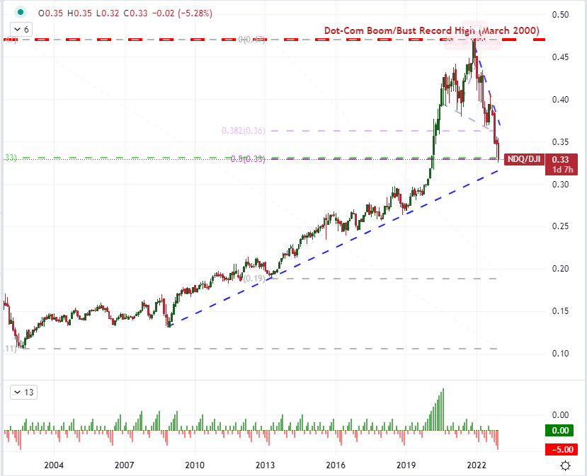
Chart Created on Tradingview Platform
As we move into 2023, there is considerable debate between the unrelenting bears who say the economic damage ahead has not been fully discounted versus the bulls that believe this last year’s retreat more than earned its technical ‘bear market’ designation. There are important considerations for what lies ahead that will ultimately factor into whether we extend or turn the 2022’s dominant trend, but there is a consideration of market conditions that I believe is informative of the type of conditions that we will experience going forward. The level of (implied) volatility that we’ve experienced this past year has certainly been elevated, but it is far from the panicky state that has accompanied some previous turning points in the financial system. Below, from the monthly chart of the VIX Volatility Index, we can see the higher general state of expected activity from the market in the 12-month moving average (equivalent to one year). Meanwhile, the extremes of volatility through 2022 were far from the complacent lows of 2017 or the ‘blow off’ levels of 2021. Should implied volatility keep this trend, it could prove more ‘productive’ support for forming trends. If we push to the extremes though, it could signal a turning point for underlying conditions.
Chart of VIX Volatility Index with 12-Month SMA (Monthly)
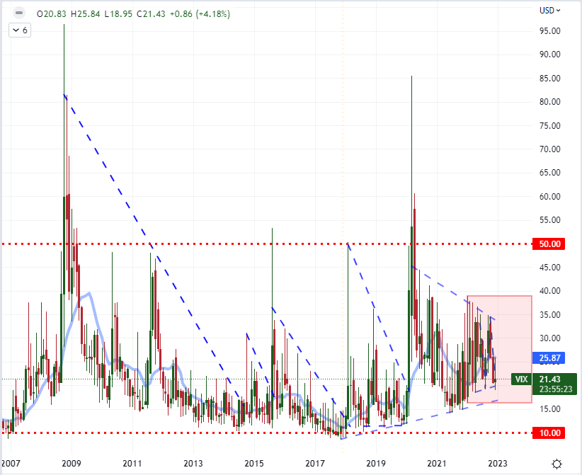
Chart Created on Tradingview Platform
If there were one fundamental theme that topped all the others for those following the FX markets, it would most likely be the dramatic swing in monetary policy. From a general policy of extreme accommodation between near-zero interest rates and unorthodox tools such as quantitative easing at the beginning of the year, we were closed out the period with substantial increases to benchmarks and the throttling of bloated stimulus programs. The shift has a significant impact on assets that are interest rate sensitive, but the relative aspect of different regions shifting at different paces helped push the US Dollar to its incredible, multi-decade peak this past September. However, where the Greenback was benefiting the combination push for carry and the general ‘risk off’ backdrop, its underlying yield advantage was deflating. The direction and intensity of risk trends is critical for the US currency moving forward; but so long as that theme holds back from extremes, the closing of the yield gap between the Fed and its peers could passively deflate the Dollar.
Recommended by John Kicklighter
Get Your Free USD Forecast
Chart of DXY Dollar Index with 1-Month ROC and US Yield Differential to EU, JP and UK (Monthly)
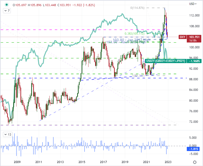
Chart Created on Tradingview Platform
You can always tell that recession fears are gaining traction in the market when reference to the ‘2-10 spread’ makes it into normal market conversations. That spread is technically the difference between the 10-year and 2-year Treasury yields. Under normal circumstances, this yield ‘curve’ should be upward sloping – meaning that longer dated debt (even from the US government) should offer a higher yield due to the increased time over which an unfavorable development could unfold. When the curve ‘inverts’ (the shorter yield is higher than the longer one), it suggests that markets are pricing in an acute risk through the nearer term to warrant a greater premium to compensate for the added uncertainty. This is why the 2-10 spread is often referred to as a recession signal to many investors. We are entering 2023 with a six-month stent of inversion and only modestly off the steepest flip in four decades. This certainly doesn’t feel like support for the ‘soft landing’ Fed officials so frequently voice hope for.
Chart of US 10-Year to 2-Year Yield Spread with 200-Day SMA (Monthly)
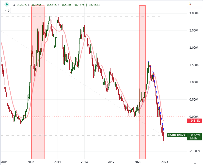
Chart Created on Tradingview Platform
A more targeted macro chart that I believe is worth reviewing is that of the US Dollar and Chinese Yuan exchange rate (USDCNH). These are the two largest economies in the world and disproportionately drag the rest of the world into expansion or contraction. Yet, these two currencies are also very different when it comes to transparency of economic and financial health as well as virtual opposites according to their principal sources of growth (the US relies heavy on domestic consumer spending while China is still rooted in factory activity supporting its export sector). This exchange rate can therefore reflect on the world’s expectations for growth as well as the need for transparency in risk for a given return. China’s decision to drop its Covid quarantine policies just this past month add fresh speculative fodder, but the bigger picture reflects upon a much greater level of volatility in this exchange rate over time. Such significant swings in the relative performance of the these major currencies and economies can have critical implications for the rest of the financial system.
Chart of USDCNH with 6-Month Average True Range (Monthly)
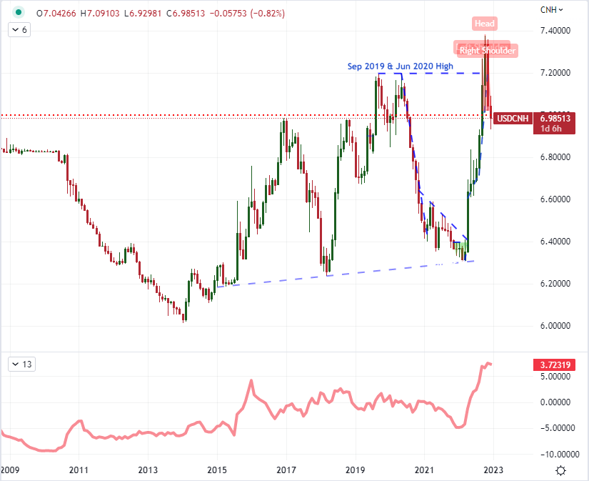
Chart Created on Tradingview Platform
Another theme that dominated the headlines – if not directly, than by proxy – in 2022 was the surge in inflation. We entered the year with the mantra from central banks that high inflation was ‘transitory’ and we ended it with 100s of basis points of rate hikes. Initially, the pandemic lock down had a severe impact on the global supply chain which translated into sharp increases in prices. That was further compounded with the flush of stimulus infused to address the economic hardship which translated to more cash chasing fewer goods. By the end of this past year, we did see some notable reductions in the pace of key inflation readings such as the US CPI (consumer price index), but the tempo is still far above most major central banks’ target levels. To add context to the tracking of inflation, interest rate potential and recession risks; following key commodity charts can be particularly useful. Different commodities can reflect different factors, but wheat is one that reflects a staple that also carries global context with the ongoing Russian invasion of Ukraine as the latter is one of the largest grains exporters in the world.
Chart of Wheat Futures Prices Overlaid with US CPI Year-Over-Year Change (Monthly)
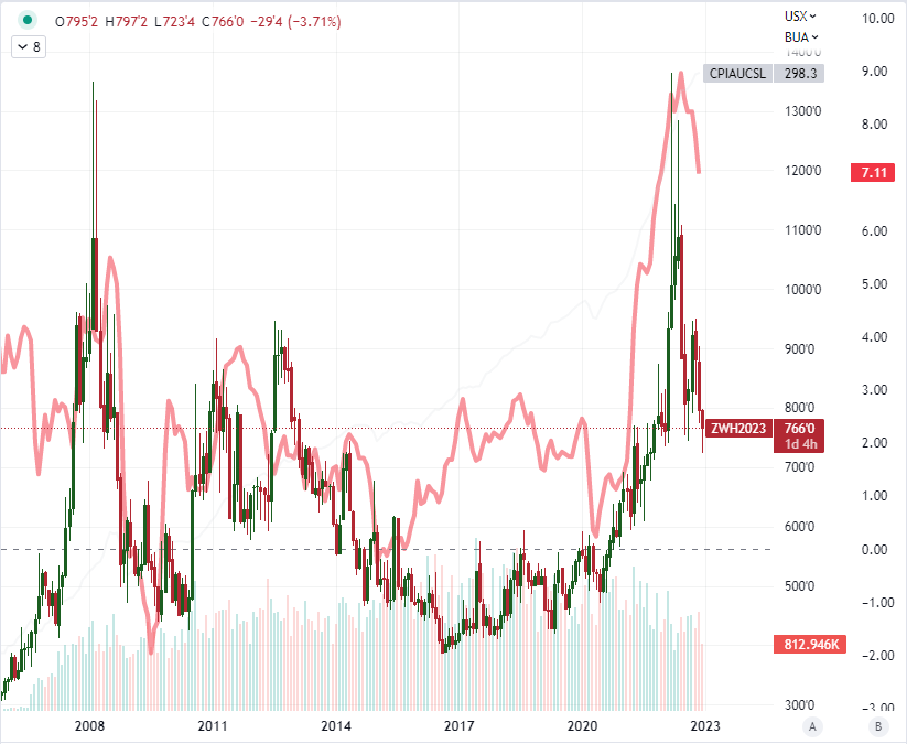
Chart Created on Tradingview Platform

Discover what kind of forex trader you are
The post VIX, Stocks, China and More first appeared on Forex Trader Hub.


